Tāpoi Māori means Māori tourism. We created the brand identity for Tāpoi Māori ō Tauranga Moana in March 2021, grounded in a whakataukī that speaks to appreciating the whenua (land) and caring for it as tūpuna (ancestors) once did.
Piki atu ki te taumata o tōku maunga, ka kite au i te mana, i te ihi o te whenua nei nō ōku tūpuna. I climb to the summit of my mountain to see the land of my ancestors.
Services Engaged:
Brand Identity
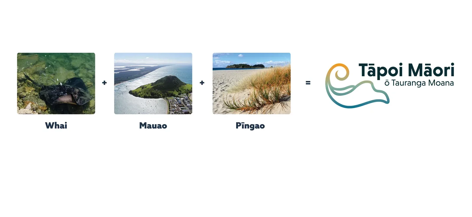
From inspiration to mark. Three elements of Tauranga Moana, each drawn from photograph to line:
Whai (stingray): abundant in Tauranga Moana. In the rōpū’s words, like their people they are ever present, quiet and gentle voyagers in the moana, a kaitiaki of protection.
Mauao: the maunga at the entrance of Tauranga Moana, a tipuna and sacred taonga, shown with the sun rising over it as a symbol of hope for the future.
Pīngao: the native sand-binding sedge, prolific in Tauranga Moana, a reminder of journeys past and present and a link to mātauranga Māori.
Together they form one tohu (mark): a whai unique to Tauranga Moana.
Refining it. In the first draft the sun was setting behind Mauao and the gold was simply called pīngao. In the final presentation the story turned to the sunrise, a symbol of hope for the future: the gold became Te Rā, the line drawings were added, and the gradient came to show the journey of Tāpoi Māori and the uara (values) that underpin their mahi.
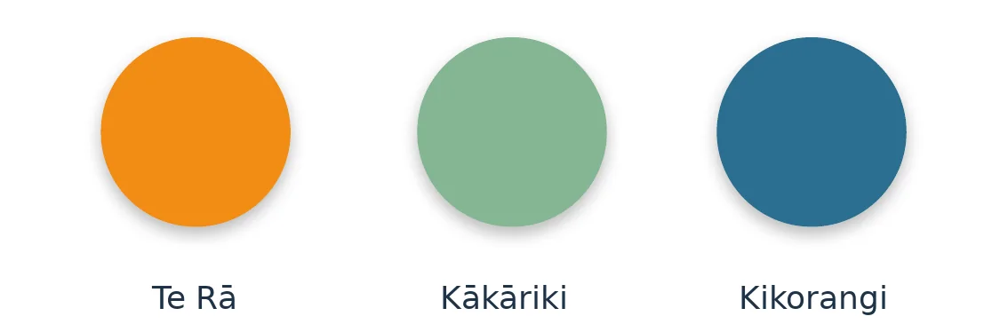
Colour with meaning. Te Rā (gold) is the tail of the whai as the sun rises over Mauao, and the link to pīngao. Kākāriki (green) is the whenua and Mauao, and a commitment to always recognise mana whenua. Kikorangi (blue) is the moana, from te kahu o te rangi, the cloak of heaven.
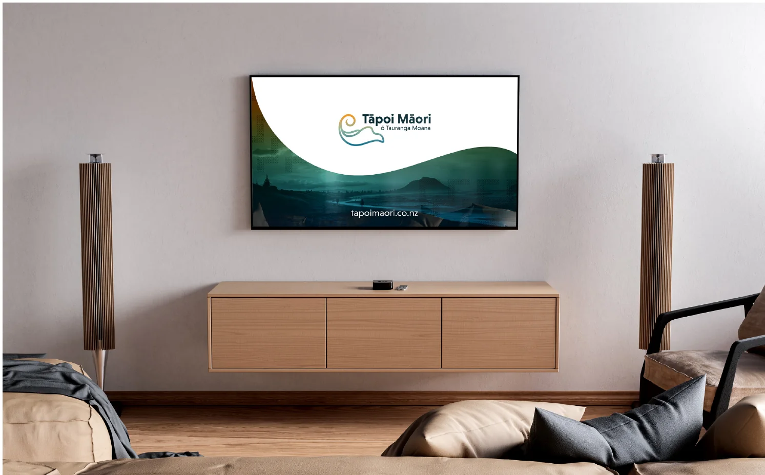
How it fits together. The presentation showed the tohu across a website, a pull-up banner and a TV advert.