We created the Pou Ora brand identity in 2025, for people in Wairoa breaking free from addiction and family harm as they forge their path forward.
The brand opens with the ancestral river name Te Wairoa Hōpūpū Hōnengenenge Mātangi Rau, “the long, bubbling, swirling, uneven waters”. It was chosen for its deep connection to the Wairoa area and because it captures the turbulent, ongoing journey to wellness.
Services Engaged:
Brand Identity Brand Guidelines
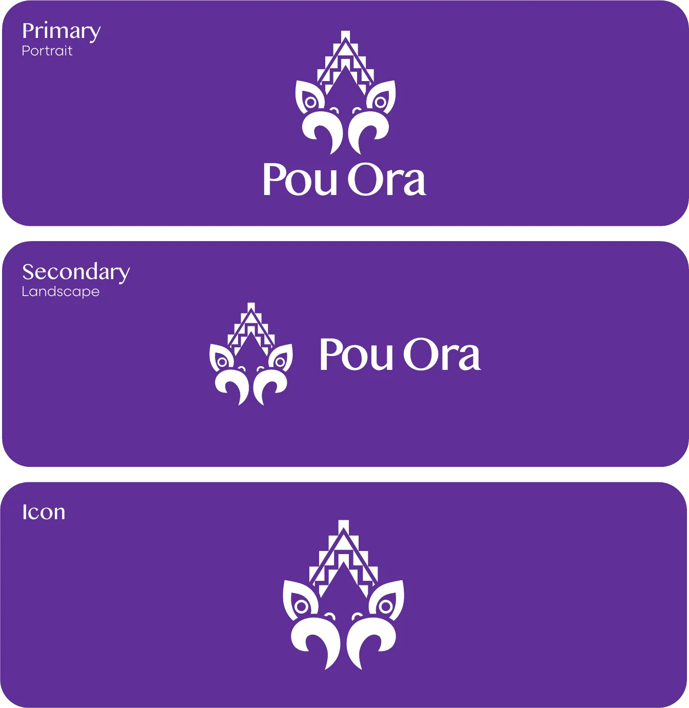
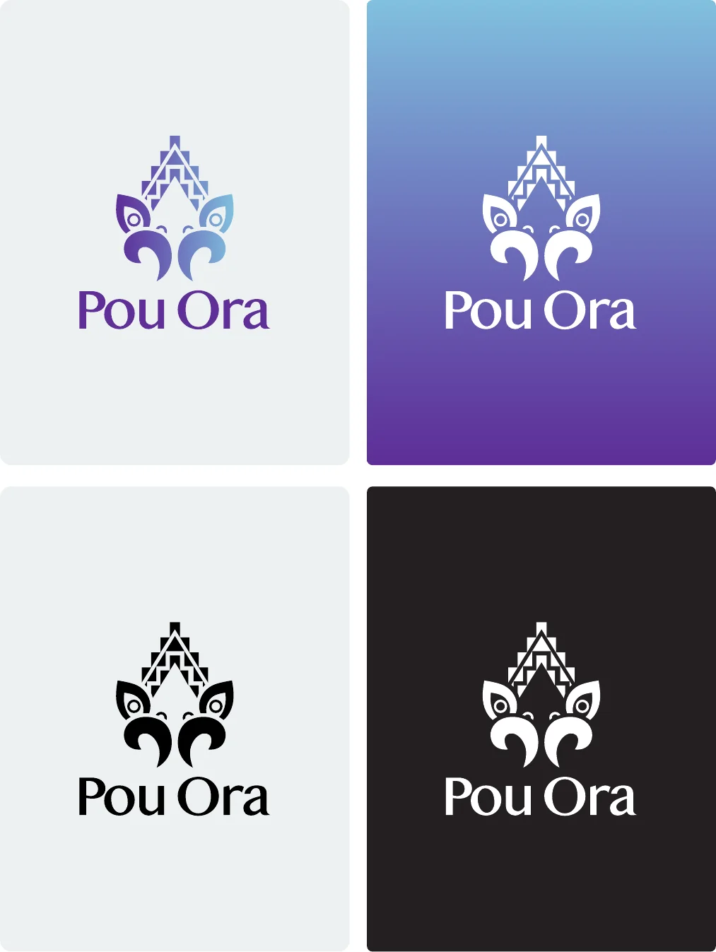
The finished brand. The primary portrait logo is the main representation of the brand, with a secondary landscape version for wide spaces and an icon for social media and small sizes. The logo is used in the Ruamano purple and Hinekorako blue gradient, or in black or white when colour is limited.
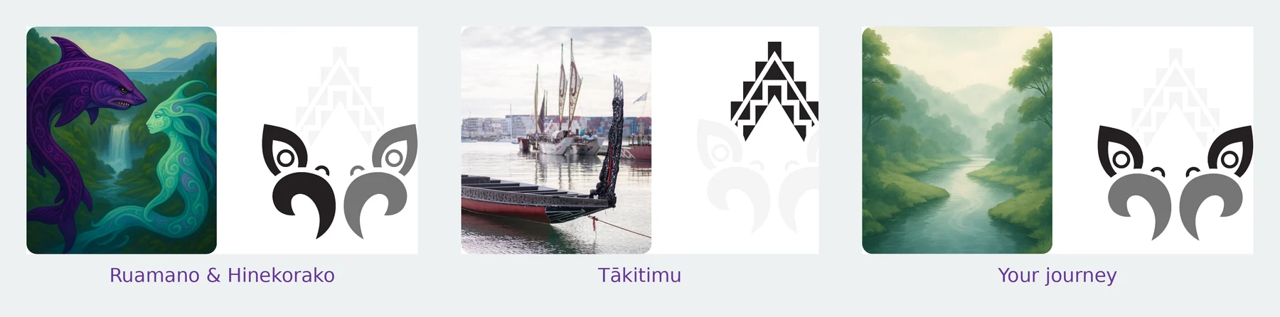
How it came together. The logo represents the journey to wellness: resilience, transformation and whānau support. It is built from three parts of the same story.
Ruamano and Hinekorako. Ruamano, a male taniwha from the Huiarau Ranges in Te Urewera, carved the Ruakituri River to the sea and guided the Tākitimu waka. He symbolises strength, transformation and protection. Hinekorako, a female taniwha, carved the Hangaroa River on her journey to the sea, and symbolises resilience, reflection and the quiet strength found in rest and renewal.
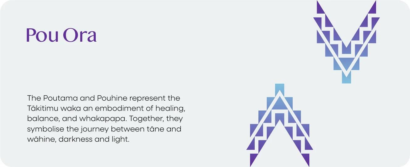
Tākitimu. At the centre, the poutama and pouhine represent the Tākitimu waka, a vessel of healing, balance and whakapapa that connects Te Reinga, Wairoa, Nuhaka and Māhia. They symbolise the journey between tāne and wāhine, darkness and light.
Your journey. The Ruakituri and Hangaroa rivers meet at Te Reinga, where the journeys of Ruamano and Hinekorako connect. Together the two taniwha represent the person on a journey of balance, healing and transformation, from taniwha to kaitiaki. Everyone faces taniwha in life, such as addiction, family harm or violence, and by confronting them people become kaitiaki of their own lives and their whānau.
Logotype. A customised serif balances a sense of history with readability, honouring the depth of the pūrākau while staying clear in every format. Subtle curves in the letterforms mirror the shapes of the icon and the flow of water, a strong presence in Wairoa through the river, Whakamahi Beach, Māhia and the surrounding lakes.
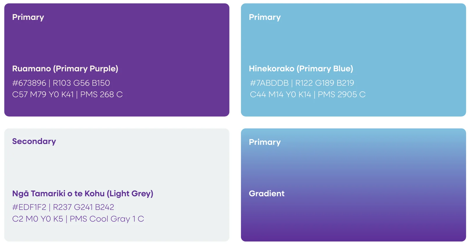
Colour with meaning. Ruamano, a deep purple, stands for strength, healing, mana, transformation and the protective nature of a kaitiaki. Hinekorako, a light, calming blue, represents emotional healing, reflection and quiet strength. Ngā Tamariki o te Kohu, the Children of the Mist, is a soft grey for the ever-present mist of the region and the shift from darkness to light, from mamae (pain) to ora (wellbeing), also expressed as a gradient from purple to blue.
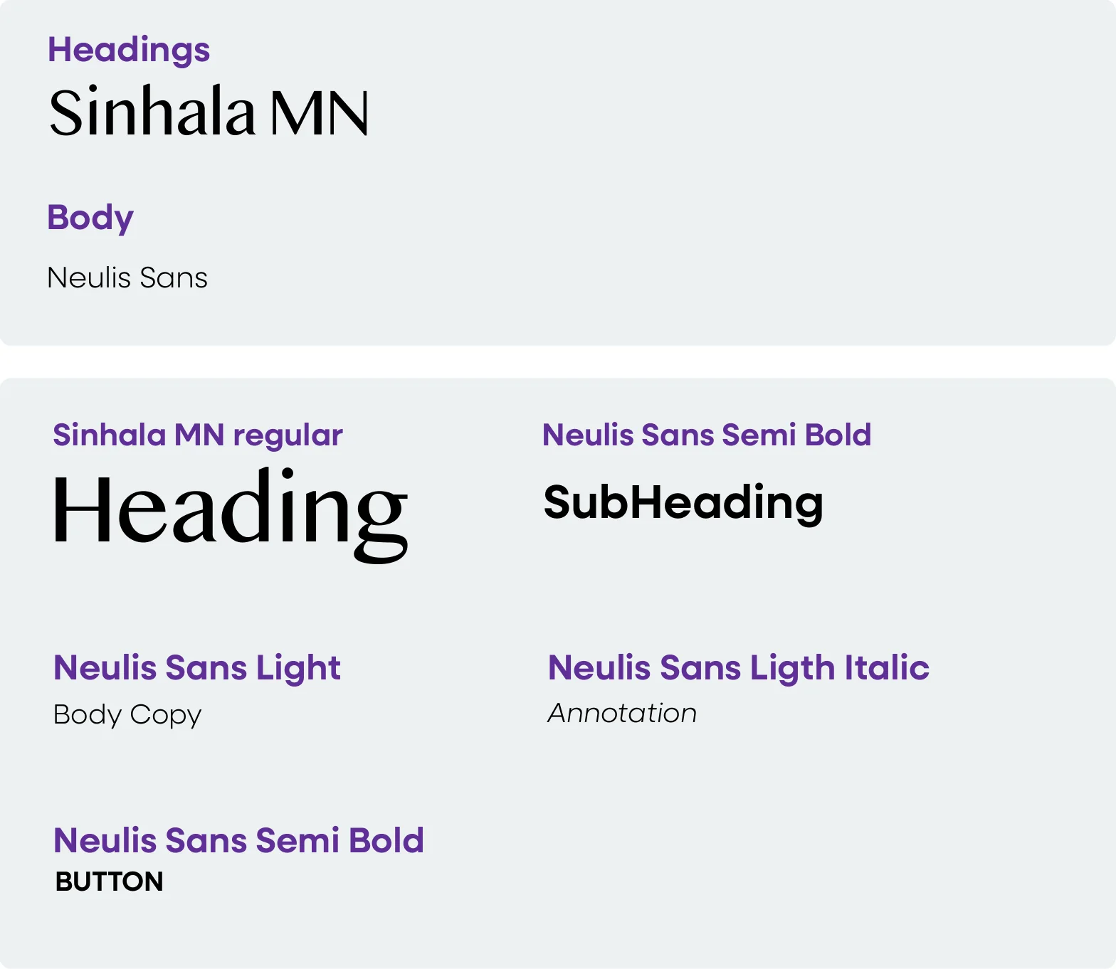
Typography. Sinhala MN is the heading typeface, chosen for its balance of heritage and clarity, and set with tight tracking for a cohesive, refined look. Neulis Sans, a clean contemporary sans serif, carries body text across print and digital.
Brand assets. The poutama pattern, inspired by the many awa across Wairoa, represents a shared journey of growth, healing and transformation, its ascending steps reflecting the strength needed to move forward through calm and turbulent times. It is layered softly over colour and photography. The Tākitimu pattern sits beside important headings to give them emphasis and authority.
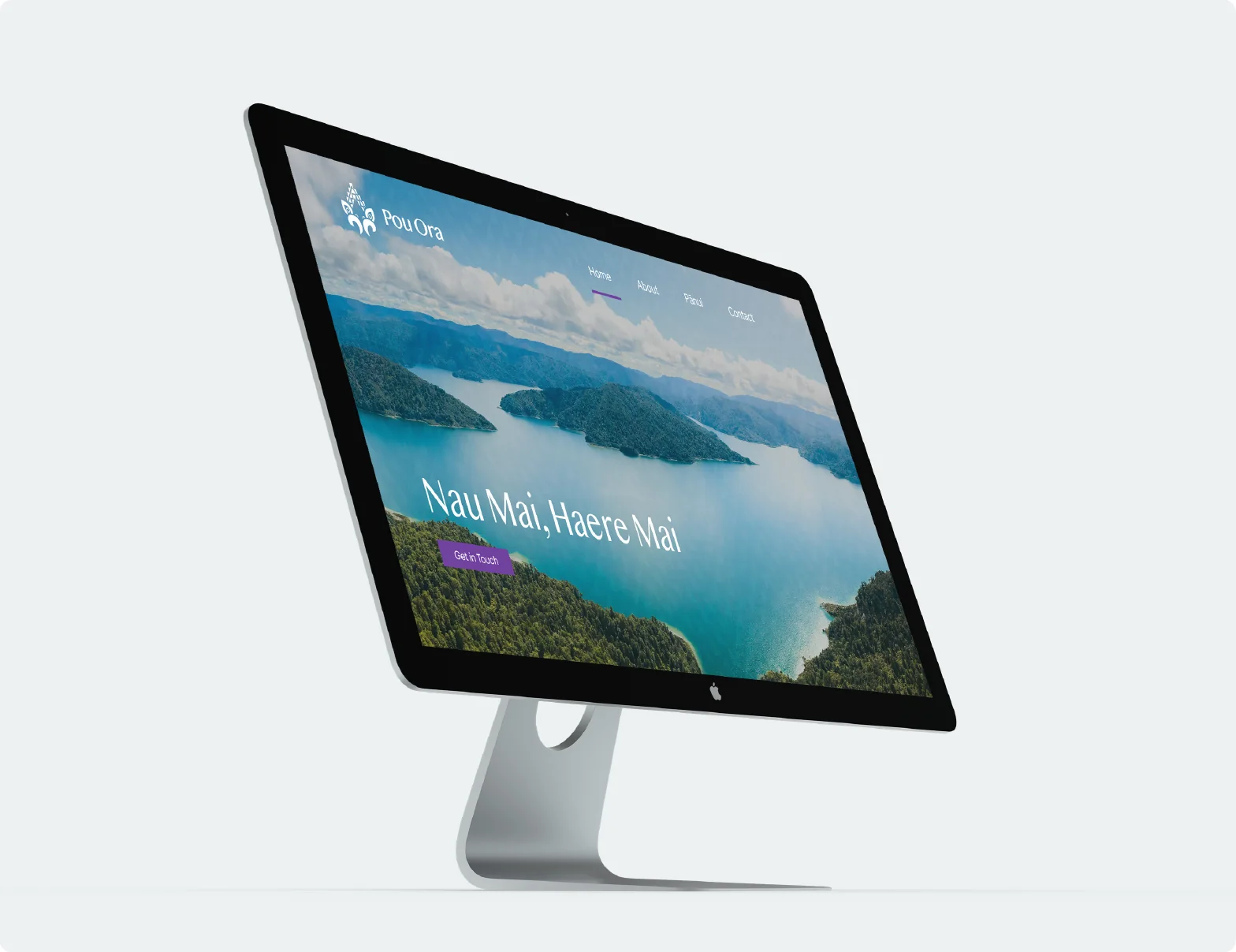
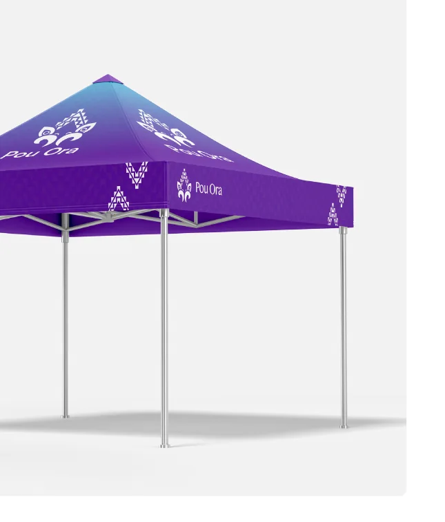
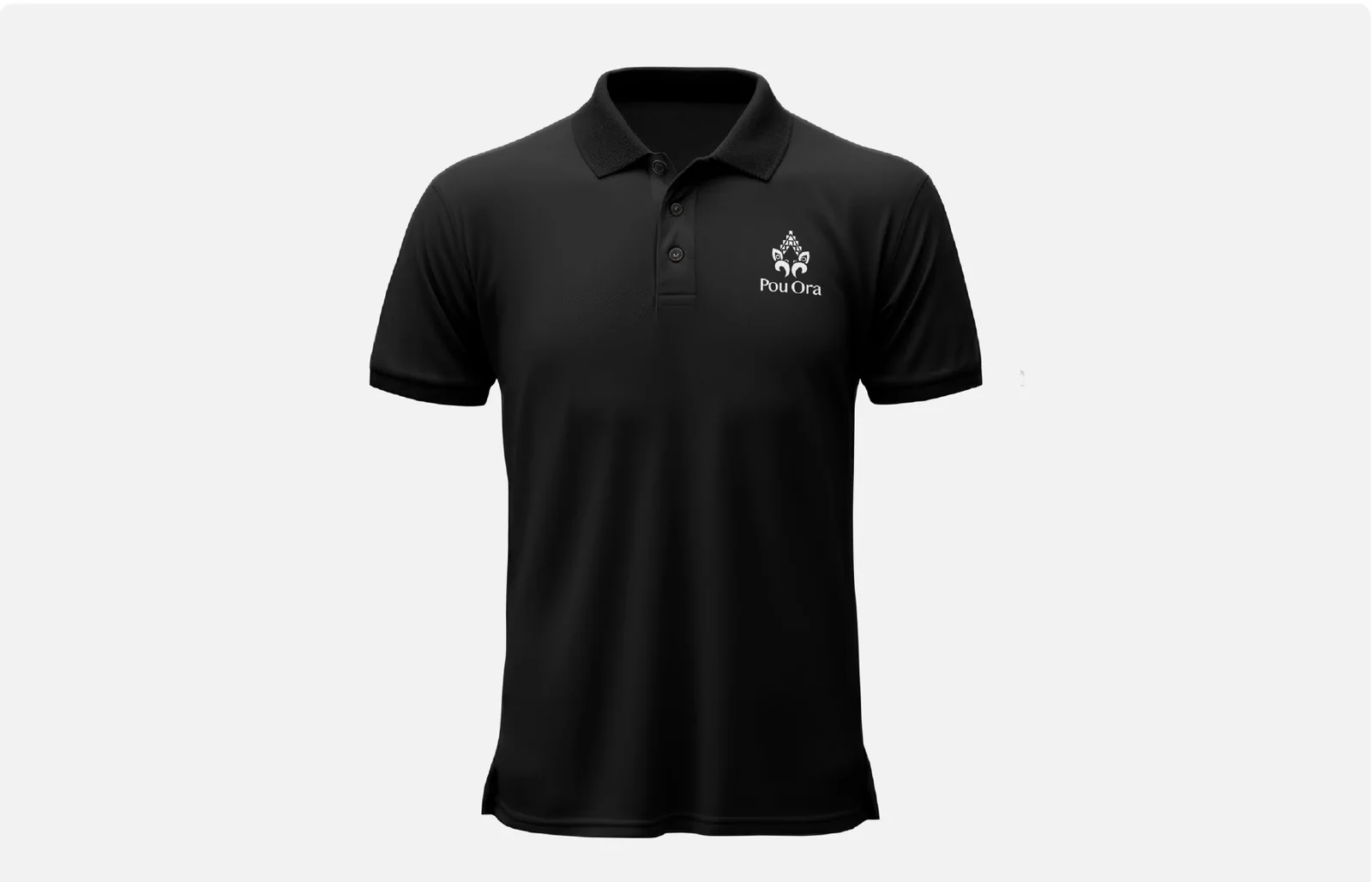
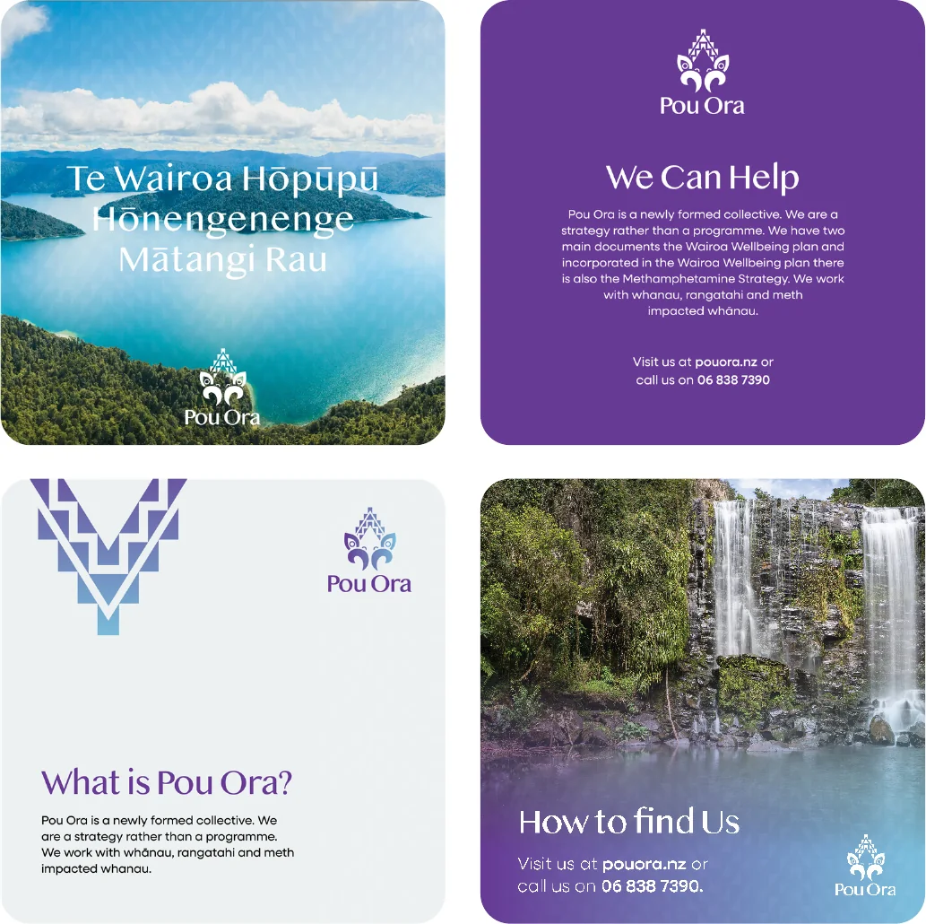
Bringing it to life. The guidelines show the brand in everyday use: a website that acts as a central hub for information, pānui and contact details; uniforms and kākahu that connect people to the brand; a gazebo where the logo, poutama and Tākitimu patterns work together for visibility at events; and social media built from the colour palette, assets and logo.