Brand identity and guidelines for Ngā Pōtiki ā Tamapahore Trust, the post-settlement governance entity that serves the current and future generations of Ngā Pōtiki iwi. The Trust supports the educational, economic, social, physical, spiritual and cultural wellbeing of Ngā Pōtiki, and cares for the natural and built environment of a rohe that runs from Parakiri (Ōmanu Beach) to Wairākei.
Kia marama taku titiro ki Tauranga Ko Rangihouhiri, ko Ranginui Kei Rangataua, ko Tamapahore Ngā pāpaka o Rangataua He paruparu te kai He taniwha ngā tāngata
Services Engaged:
Brand Identity Brand Guidelines
The finished brand. The primary logo sets Milk White against Tohorā Blue, the secondary logo reverses it, and the icon carries the brand on its own. A Trust version adds “ā Tamapahore Trust” beneath the name and is kept for documents and communications from the Trust itself. The logo is used in Tohorā Blue, Milk White, black or white, chosen to suit a light or dark background.
How it came together. The logo icon is three whale tails: the father, mother and pēpi whale from the legend of Mangatawa, who remain together forever. It is a visual expression of Ngā Pōtiki’s cultural heritage and of the Trust’s commitment to the wellbeing and prosperity of present and future generations.
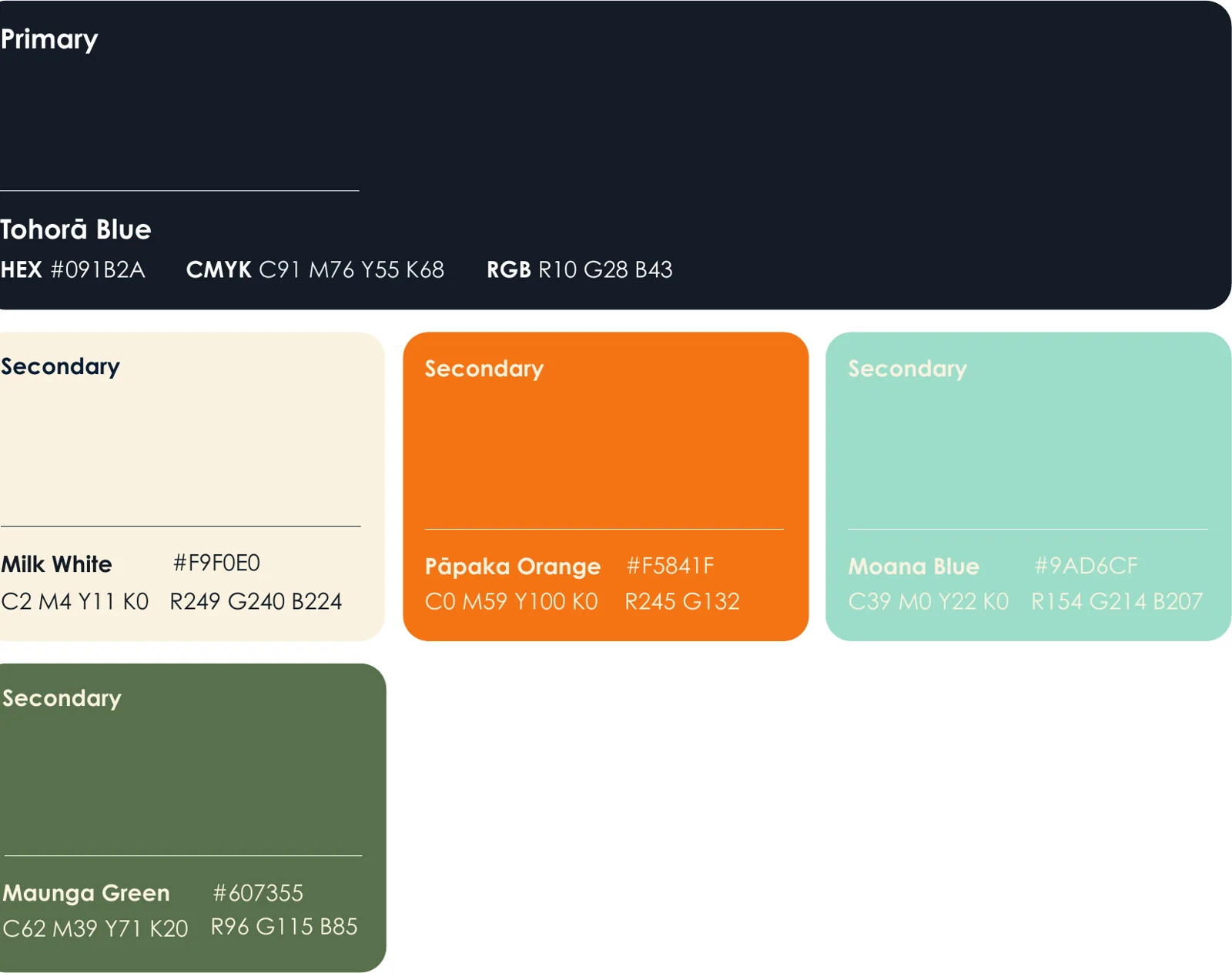
Colour with meaning. Tohorā Blue reflects the presence of the tohorā (whales) in Tauranga Moana and the enduring bond between family members in the Mangatawa legend. Milk White is the colour of the water that sometimes flows through the spring at Mangatawa, Te Waiū o te Tohorā, the milk of the whale. Pāpaka Orange, inspired by the pāpaka (crab), stands for vitality and a healthy environment for future generations. Moana Blue draws on the waters of Tauranga Moana, and Maunga Green on the connection between the land and its people.
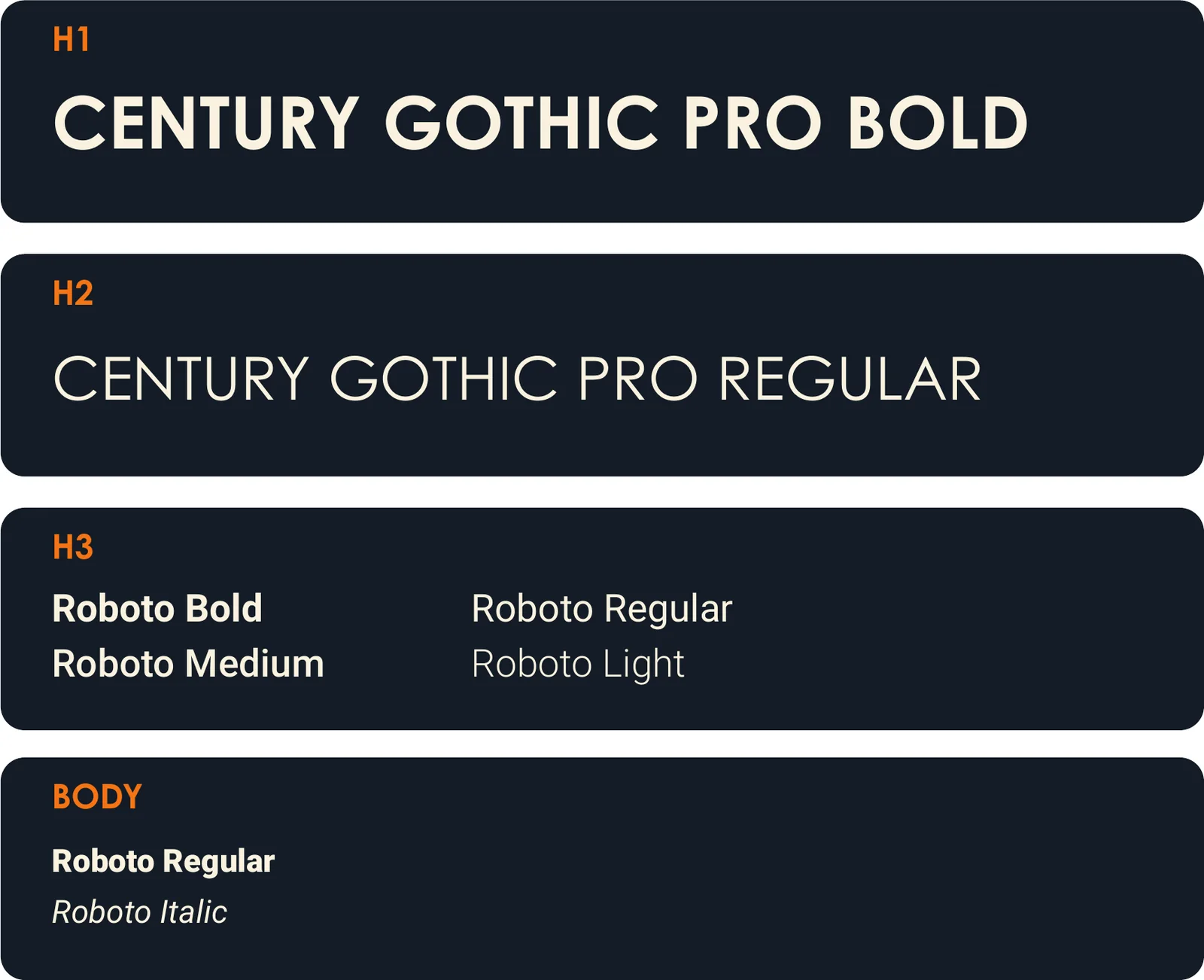
Typography. Century Gothic Pro carries headings with a bold, clean presence, and Roboto, a versatile sans serif, carries body text across print and digital.
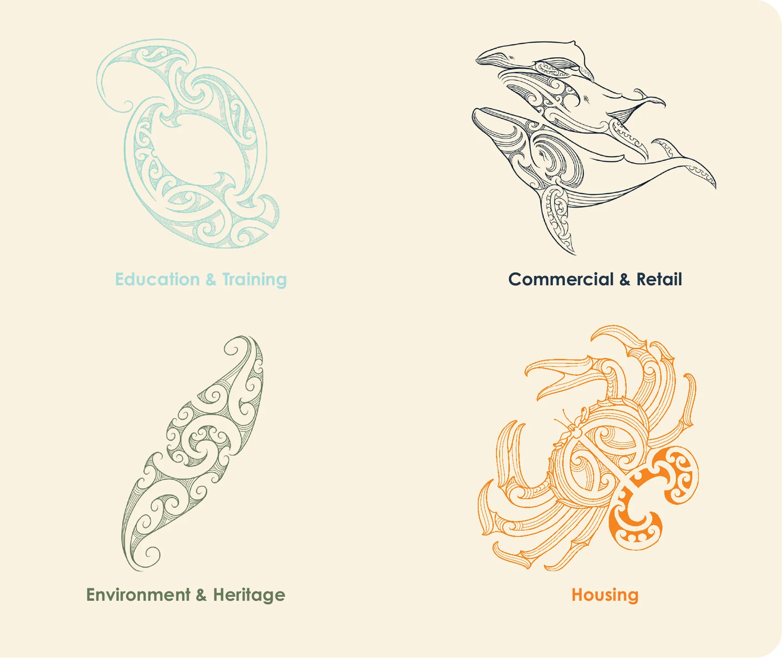
Brand assets. Four illustrated assets represent the Trust’s areas of work: Education and Training, Commercial and Retail, Environment and Heritage, and Housing.
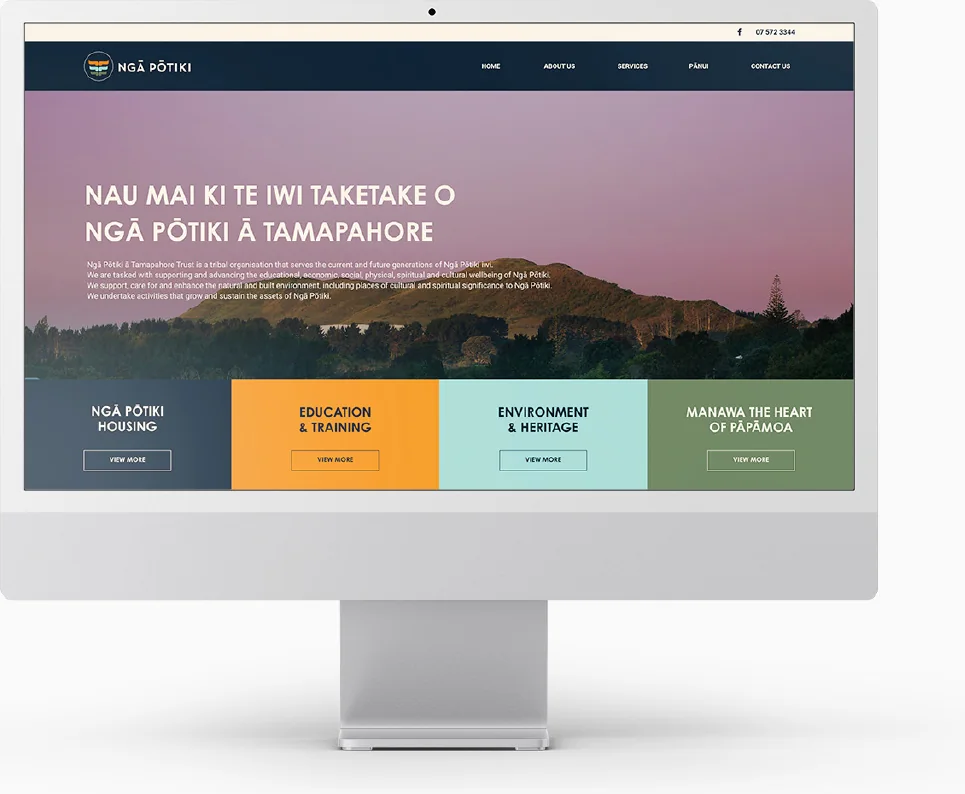
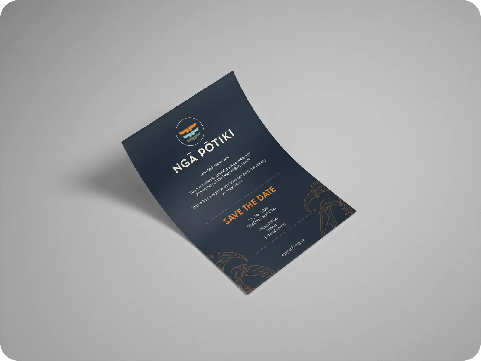
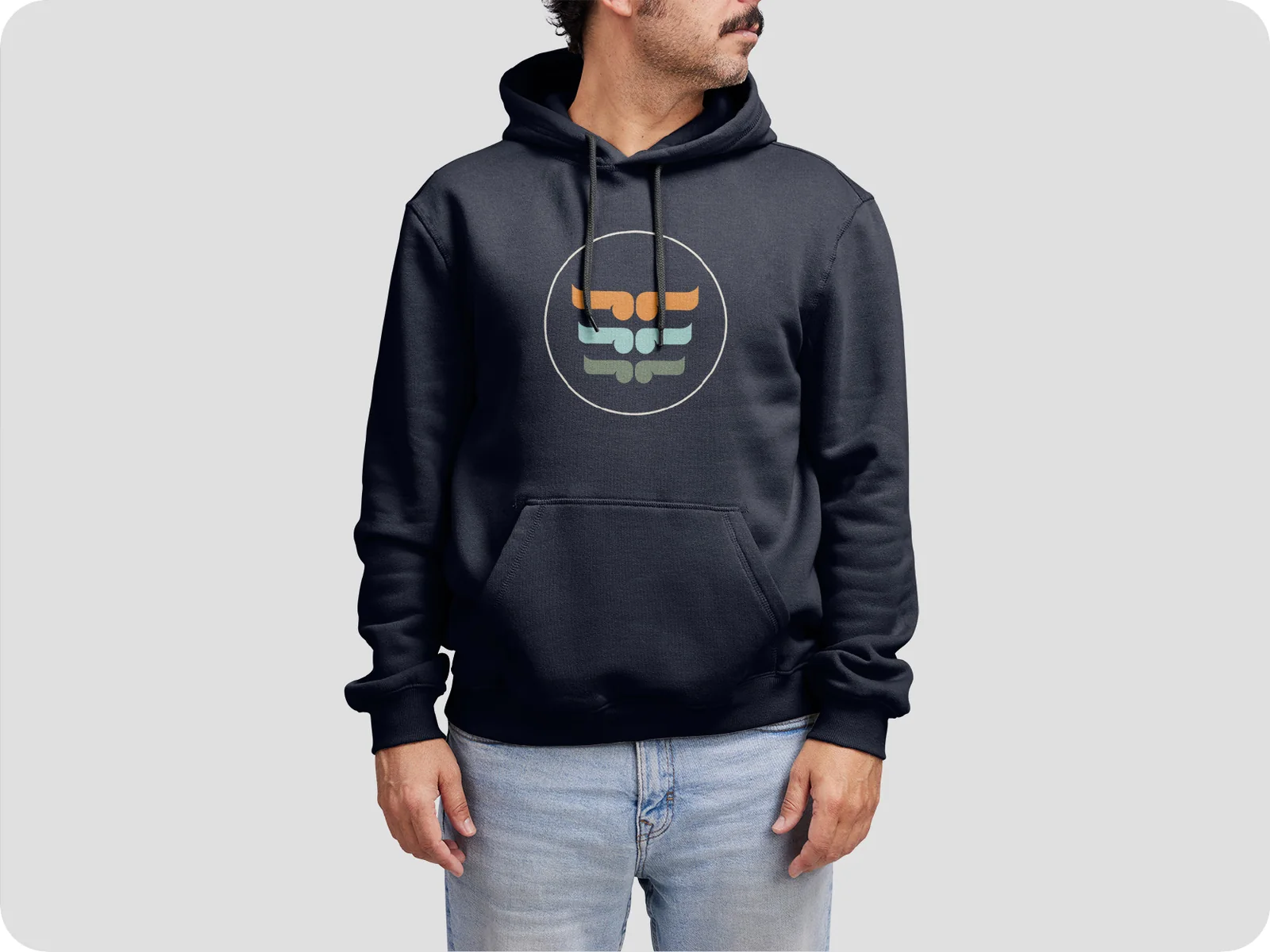
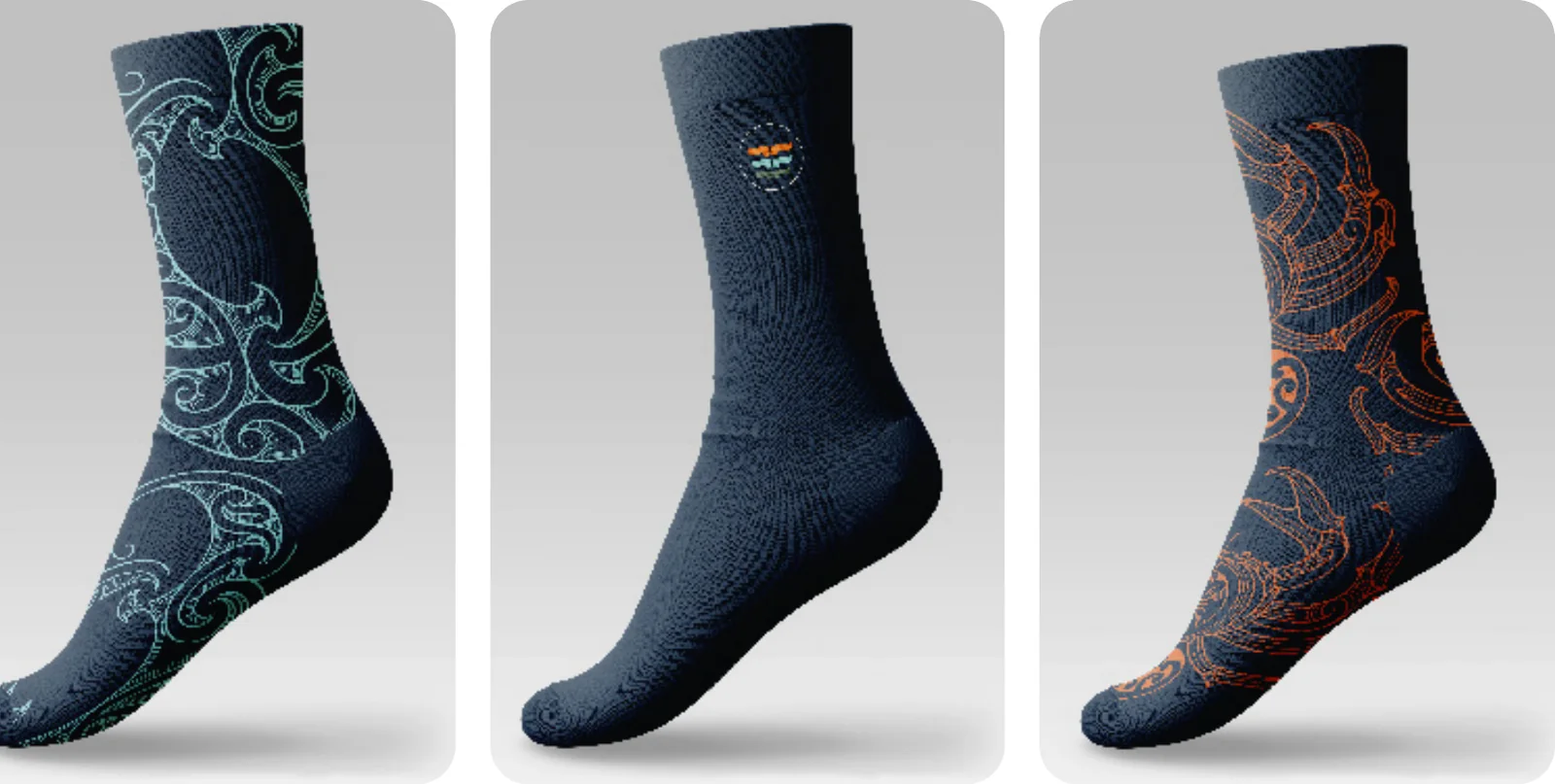
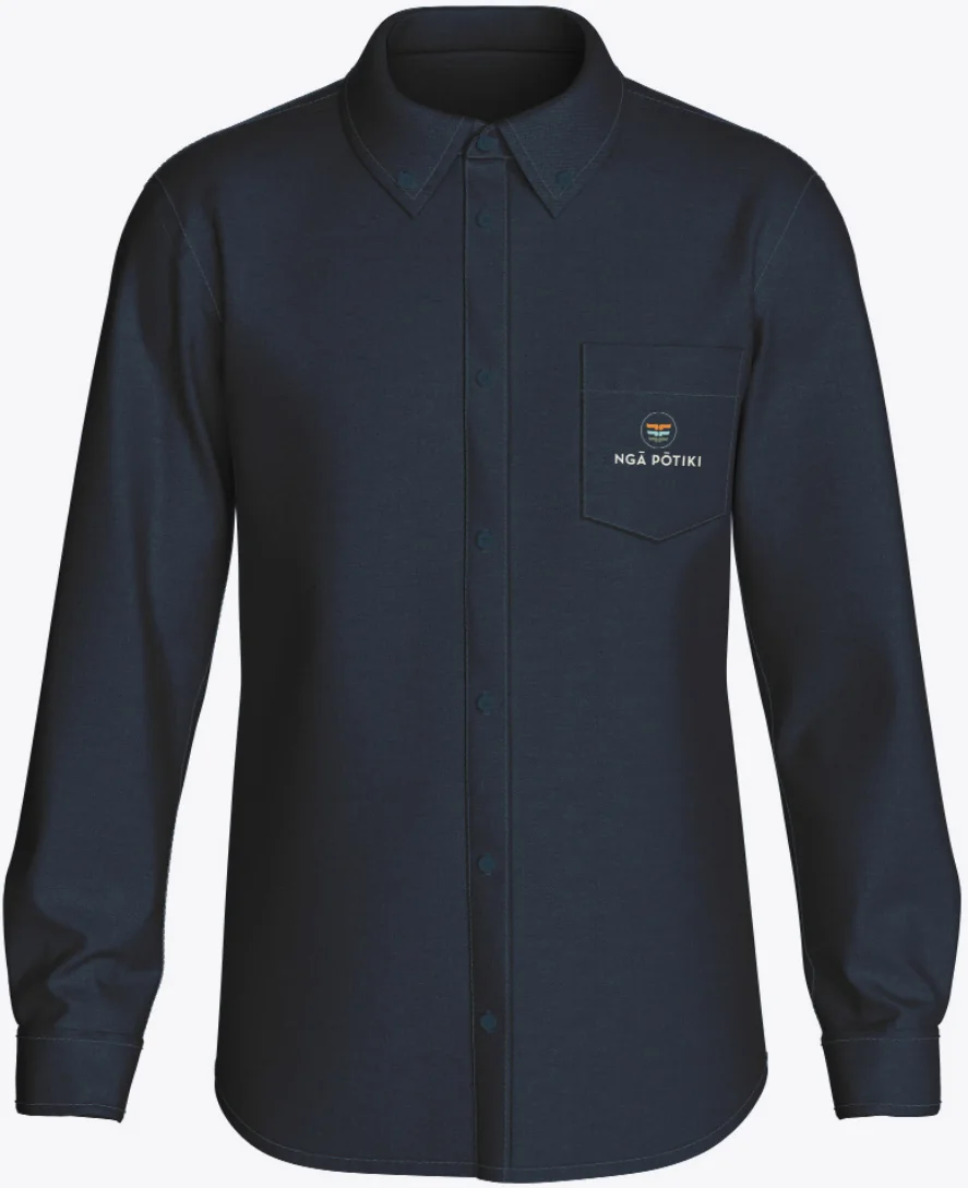
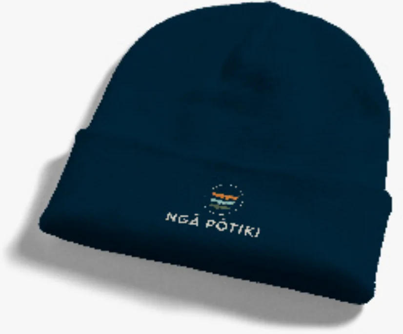
Bringing it to life. The guidelines show the brand in use: a website built on the brand’s colours, logo and typography; an invitation with the logo as its focal point on Tohorā Blue and the pāpaka asset at its base; and kākahu including a hoodie, socks, a business shirt and a beanie, each carrying the logo or icon on Tohorā Blue.